University of alabama
at Birmingham
National Alumni Society
The UAB National Alumni Society is designed to promote the welfare and excellence of The University of Alabama at Birmingham and to assist in the development and support of a mutually beneficial relationship between UAB and its alumni.
Company
University of Alabama at Birmingham
Services
Website Design, User Experience
Project Facilitator
Project challenge/ Problem
An alumni society for everyone
In 2020, the University of Alabama at Birmingham (UAB) took a significant step by eliminating financial barriers for all graduates. UAB offered an inclusive opportunity for new, existing, and soon-to-be alumni to join the National Alumni Society. This decision granted access to a diverse range of benefits without the burden of dues and sign-up fees, ensuring that all graduates could fully participate in the alumni community.
For this project, my responsibility was to design a microsite for the campaign, offering users a seamless and engaging experience that motivated them to participate in the good news. The microsite followed effectively what was an inclusive marketing strategy, devised by Burton, which targeted both recent and former graduates through social media, digital ads, and email blasts. Upon reaching the website, users were encouraged to create a simple profile, contributing to social proof that, in turn, inspired more users to sign up and join the movement. The overall objective was to foster a sense of community and inclusivity, driving widespread engagement and amplifying the campaign's positive impact.
Exploring the needs for the UAB National Alumni Society (NAS) campaign
The action of making it open to all grads was taken presumably due to less than nominal effectiveness of the current format of fees and dues.
How could users be funneled to the desired action?
How can I maintain consistency with the overall UAB brand, while still creating a unique experience for this campaign?
Since alumni and soon-to-be alumni are the target, what is this demographic comprised of?
How do we intend to measure success?
Outside of the goal of users creating profiles are there any secondary objectives?
REsearch / Highlights
We’re in, are you?
While researching the best way to approach this campaign, I really honed in on how to get users to participate. In order to do this correctly, it was necessary for me to develop a seamless experience that was able to quickly address the major talking points of the campaign, provide the social proof of alumni engaging, and ultimately get users to commit to creating a profile. As I mentioned before, I was able to identify the inclusive marketing strategy that was in play in the broader arc of the campaign, taking this to my advantage and really wanting to highlight the idea of pulling users into the UAB Alumni community. Each profile could provide a sense of pride for users, showing their successes as a graduate and encourage others to want to do the same.
Since UAB graduates come in all shapes and sizes, it was necessary to address the overall design needed to meet the fairly broad demographic somewhere in the middle. Whatever I designed needed to be very easy to navigate and be accessible to a wide range of users.
Research points related to the changes in UAB's National Alumni Society (NAS) program:
Prior to the change of criteria, there were issues with how effective the program was in relation to engaged alumni.
With the new criteria, UAB’s National Alumni Society would represent over 150,000 alumni.
UAB graduates would be automatically enrolled into the NAS program.
Following NAS enrollment, alumni would be eligible to a wide range of benefits unique to the program including discounts for travel, healthcare, and security.
Design And UX solutions
Uniting UAB's Graduates for Lasting Impact
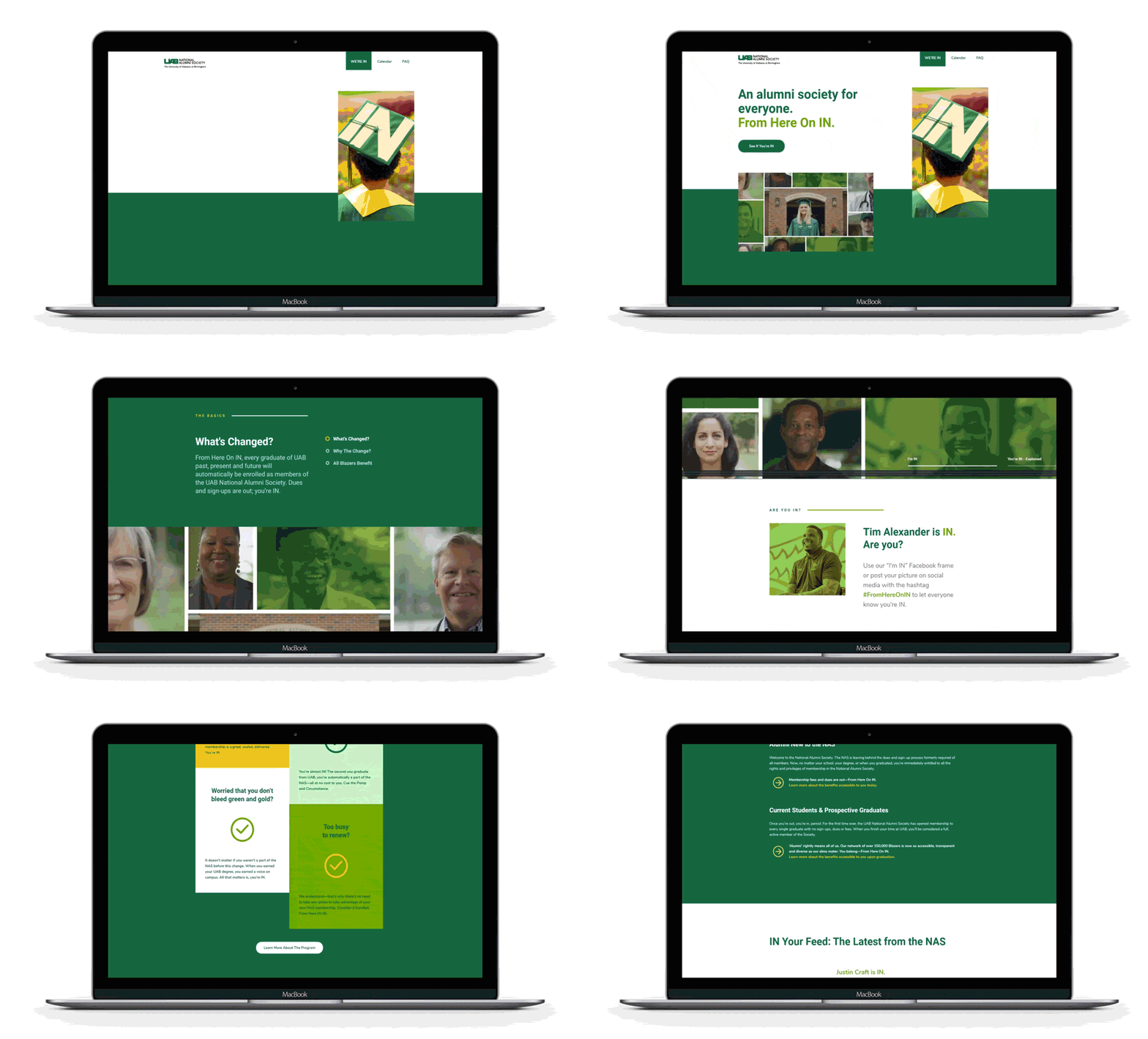
Design for the site needed to be simple and effective. I wanted the spirit of UAB without creating a carbon copy of their existing website with some change in information, but also wanted it to be inviting and promote user engagement. I chose to focus on the core colors associated with UAB, introduce simplistic icons, and make use of solid colors and simple shapes. To balance out the simplicity, various sections had subtle transitions to bring the site to life.
The homepage focused on driving users to create a profile, while also addressing important questions about the change, eligibility, current participants, and benefits. In the navigation users would find a FAQ link to answer any additional questions that weren’t addressed on the homepage.
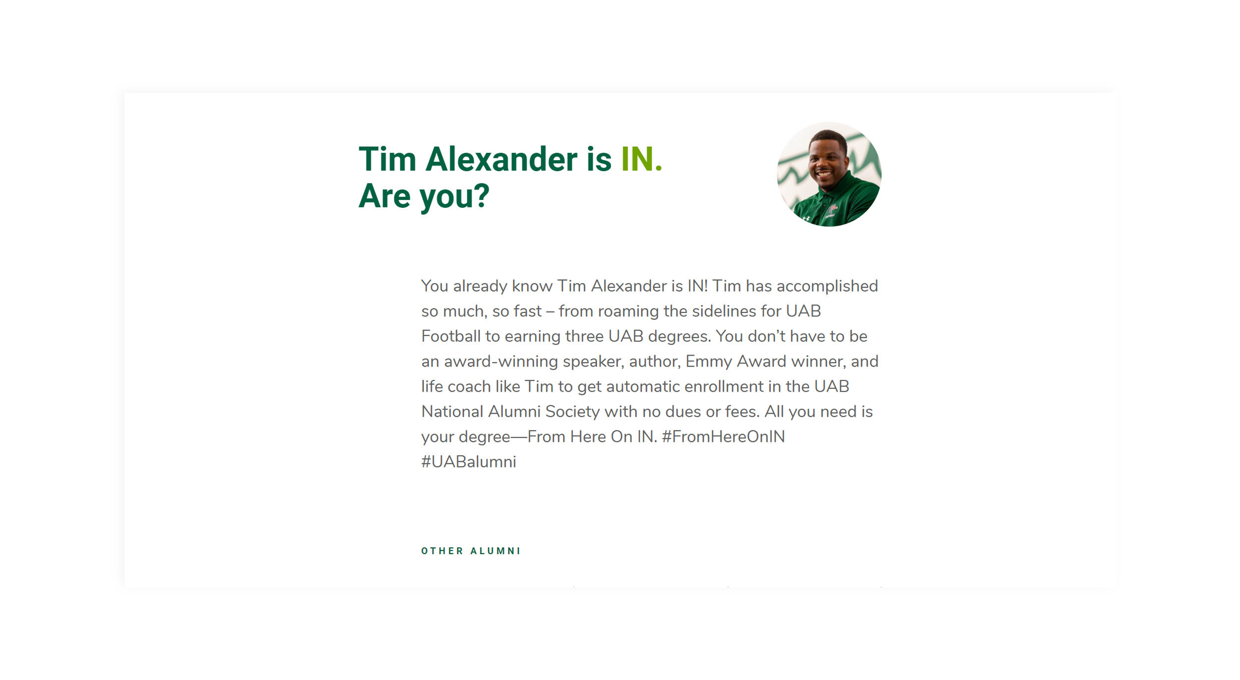
The alumni listing page provided a comprehensive list of participants, with an open slot for new users to join by creating their own profile. The profile included a name, email address for future updates, and a public bio. To humanize the experience, users were given the option to upload their photo.
Overall the project was a success. Although the numbers for complete conversions did not reflect the 150,000+ represented Alumni, it did have a significant amount of engagement in regards to what was expected. The campaign as of 2023 is still active with close to 300 participants and definitely still has users creating profiles and leaving an everlasting mark.


