SPOC AUTOMATION
Lift Up Program
Lift Up was created to highlight the culture, mission, and overall goals of SPOC Automation as a team. My primary task involved crafting an enticing experience for prospective clients as well as instilling confidence in current employees and potential hires.
Company
SPOC Automation
Services
Website Design, User Experience
Photography
Project Facilitator
Project challenge/ Problem
Lift Up: From Brochure to Web Experience
Originally conceived as a brochure, it was quickly recognized the potential of transforming Lift Up into an informative web experience in the form of a microsite. While initially intended as an onboarding tool for new employees, there was opportunity to leverage this information in multiple ways. It became clear that Lift Up could serve as a valuable resource to attract potential hires, offer a glimpse behind the scenes to existing clients, and provide reassurance regarding the quality of their work for prospective buyers.
Before starting, I identified a few major points:
How can we create an engaging and user-friendly web experience that appeals to both potential clients and hires?
How can we ensure a seamless onboarding experience for new employees?
What content and sections should be included to provide insights to existing clients and assure them of the quality of SPOC Automation's products?
How do we intend to measure success?
Original page
REsearch / Highlights
Business Culture Representation
In the research phase of this project, I reviewed different companies in the oil and gas sector as well as other product-oriented businesses. The primary focus was to analyze how these companies successfully showcased their business culture through website messaging, imagery, and overall presentation. The research aimed to identify whether these companies attracted a range of demographics and if any of those demographics shared resemblances with the target audience SPOC Automation aimed to engage.
Lift Up had three audiences they intended to appeal to:
New and existing employees, who were able to use the microsite as a guide to SPOC’s core values and provide them with insight to what is expected of each employee during their journey.
Potential hires who are seeking employment and want to get a better understanding of SPOC’s culture
Prospect company shareholders interested in working with SPOC.
Design And UX solutions
Fostering Human Connections at SPOC
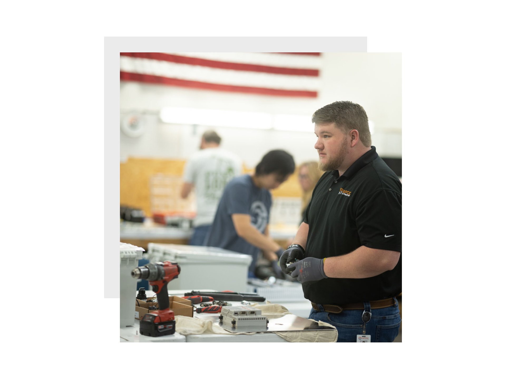
My approach to design was simple. I wanted to provide a refreshing experience for users that was easy to read, addressed the key points of Lift Up, and ensured easy access for curious prospects to apply for open positions at SPOC throughout the site. There needed to be a certain level of technical prowess that was represented in the design and captured through simple shapes and colors. From previous research it was important to display the people of SPOC in order to create a necessary human connection. I wanted users to feel like the staff of SPOC were not only a diverse family (which they are), but a family they wanted to be a part of.
As a result of the redesign, there was an increase of %646 in overall site traffic.


